CATEGORIES
- Terracotta Cladding
- Ceramic Art
- Metal Cladding
- Casted Aluminum
- Performance Louver
- Architectural Glass
- Glass Fittings
Case Study on the Ceramic Tiles in Aesop
Traditionally, some stores will deepen consumers' image of themselves through unified and standardized decoration styles.
In contrast, an Australian skincare brand offers a new concept----The Taxonomy of Design. Given this, it is impossible to find two Aesop stores with the same style.
Today, from Berlin, Paris, Los Angeles, Kyoto, to Singapore and many other cities, Aesop has more than 100 stores around the world.
For you,here to see how the ceramic tiles in Aesop Stores create the charm of The Taxonomy of Design.
lBerlin, Germany
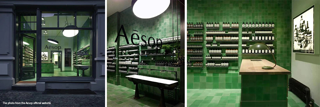

Weiss-heiten designed Aesop's first signature store in Germany. The store is located in Alte Schonhauser Straße in Berlin Mitte.
Inspired by Gerhard Richter's monochromatic cloth paintings, the interior design uses green rough ceramic tiles. Built to reflect the unique qualities and cultural heritage of the local,it embodies the relationship between roughness and beauty, city and nature.
lBrussels,Belgium

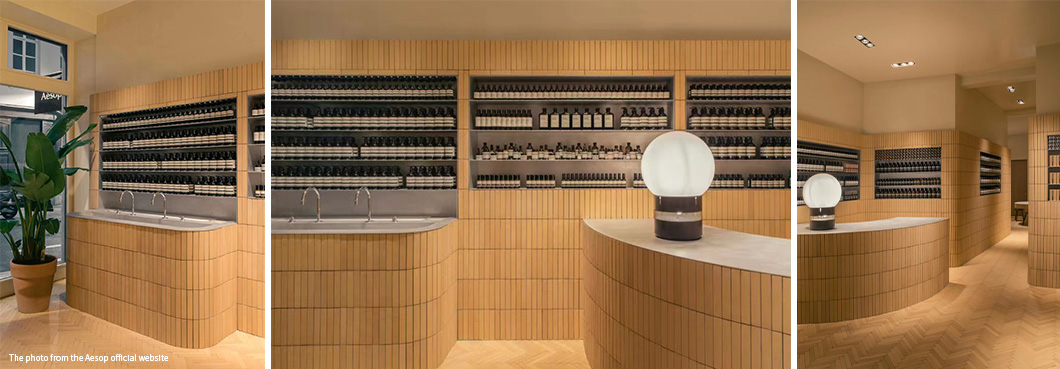
Designed by Bernard Dubois for Aesop,the store reinterprets the distinctive yellow ceramic tiles of 1930s Belgium.
The ceramic tiles on the walls of the shop are placed vertically, indirectly giving the gray environment a tropical feel.The ceramic tiles on the floor create a parquet effect.
The atmosphere here is reinterpreted by the ceramic tiles.It is not difficult to see that the collision of ceramic tiles and different decoration can also highlight different styles.
lDoncaster Australia
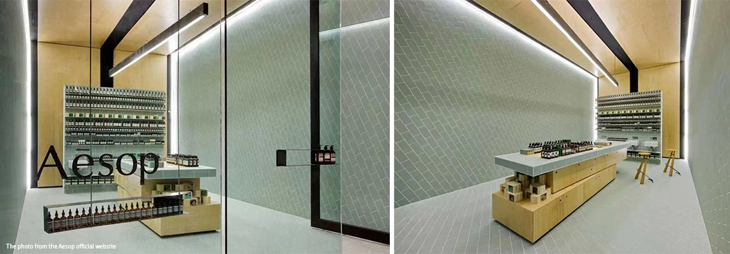
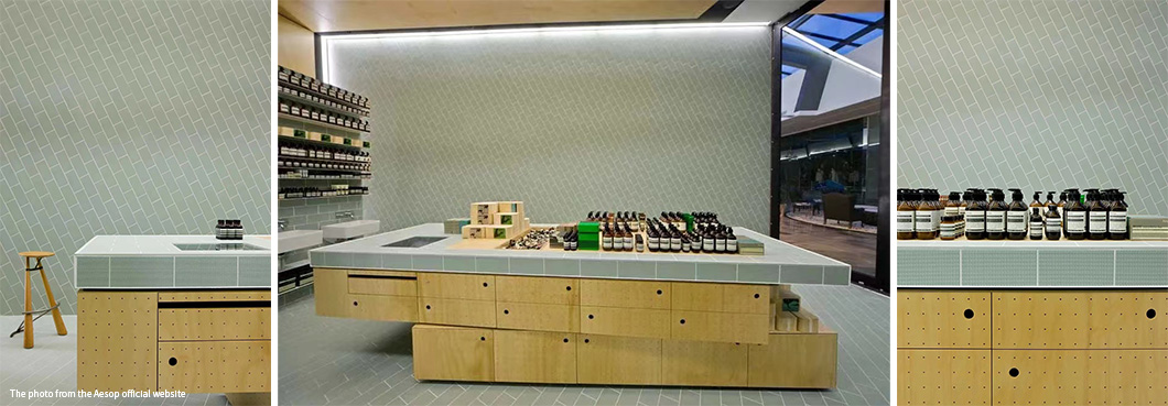
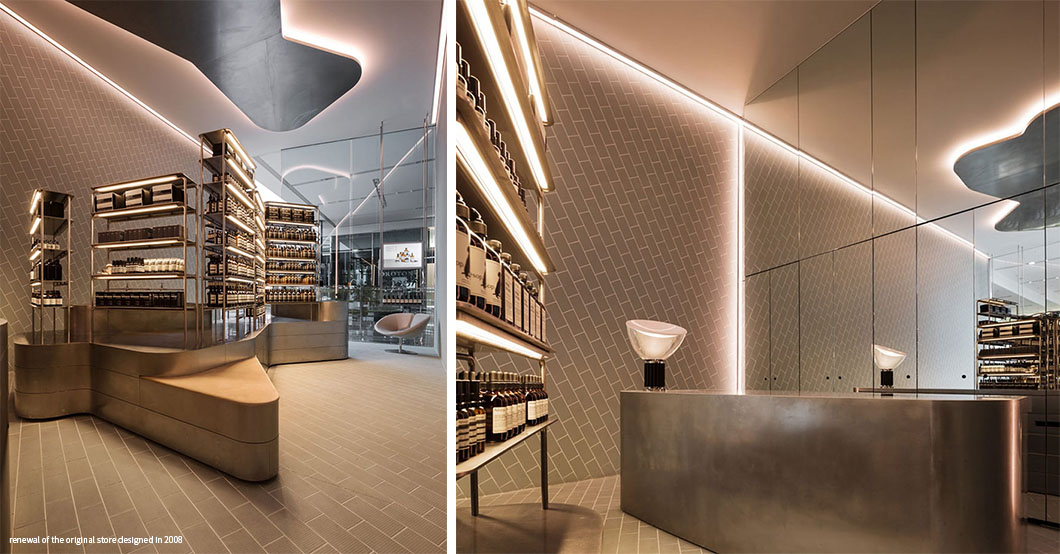
The design creates a visually stimulating space in enclosed conditions. Pastel colors and simple ceramic tiles are subverted through unique texturing and composition applications to attract customers. The ceramic tile also gives the customer a relaxed sense of bathing.
Based on the original foundation, the renovated Aesop Doncaster space reminds its occupants of the pleasures and subtleties of bathing. The aim of the design was to create a space where the client could explore freely.
lLos Angeles, USA
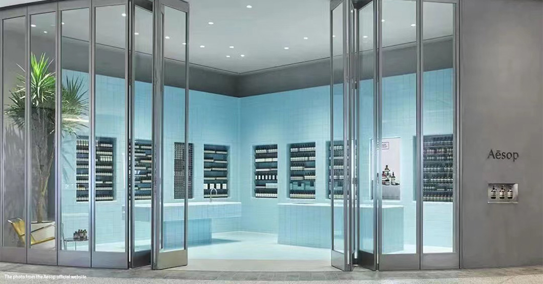
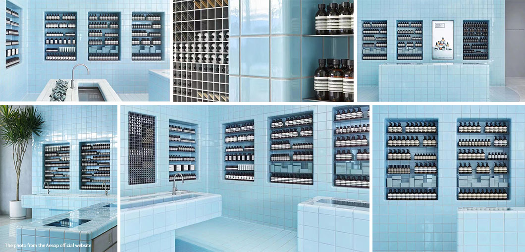
The Aesop Cenntury City in Santa Monica, California, draws inspiration from a more hedonistic tradition. The pool-like design perfectly embodies the casual romance of the West Coast.
The overall style is based on the "azure ocean", and 3,942 blue ceramic tiles outline the floor, walls, counters and shelves inside the store. The natural, environmentally friendly and self-cleaning properties of the ceramic materials are perfectly compatible with Aesop's consistent design philosophy. Pieces of ceramic tile forged a beautiful blue handicraft.
The value of design space for a brand increases greatly. Aesop draws on the history and culture of the store design, so that each store is a piece of art. Now the collision between design and terracotta products brings people infinite surprises.
If you have any need for shop design, please contact us.
In contrast, an Australian skincare brand offers a new concept----The Taxonomy of Design. Given this, it is impossible to find two Aesop stores with the same style.
Today, from Berlin, Paris, Los Angeles, Kyoto, to Singapore and many other cities, Aesop has more than 100 stores around the world.
For you,here to see how the ceramic tiles in Aesop Stores create the charm of The Taxonomy of Design.
lBerlin, Germany


Weiss-heiten designed Aesop's first signature store in Germany. The store is located in Alte Schonhauser Straße in Berlin Mitte.
Inspired by Gerhard Richter's monochromatic cloth paintings, the interior design uses green rough ceramic tiles. Built to reflect the unique qualities and cultural heritage of the local,it embodies the relationship between roughness and beauty, city and nature.
lBrussels,Belgium


Designed by Bernard Dubois for Aesop,the store reinterprets the distinctive yellow ceramic tiles of 1930s Belgium.
The ceramic tiles on the walls of the shop are placed vertically, indirectly giving the gray environment a tropical feel.The ceramic tiles on the floor create a parquet effect.
The atmosphere here is reinterpreted by the ceramic tiles.It is not difficult to see that the collision of ceramic tiles and different decoration can also highlight different styles.
lDoncaster Australia


The design creates a visually stimulating space in enclosed conditions. Pastel colors and simple ceramic tiles are subverted through unique texturing and composition applications to attract customers. The ceramic tile also gives the customer a relaxed sense of bathing.
Based on the original foundation, the renovated Aesop Doncaster space reminds its occupants of the pleasures and subtleties of bathing. The aim of the design was to create a space where the client could explore freely.

lLos Angeles, USA


The Aesop Cenntury City in Santa Monica, California, draws inspiration from a more hedonistic tradition. The pool-like design perfectly embodies the casual romance of the West Coast.
The overall style is based on the "azure ocean", and 3,942 blue ceramic tiles outline the floor, walls, counters and shelves inside the store. The natural, environmentally friendly and self-cleaning properties of the ceramic materials are perfectly compatible with Aesop's consistent design philosophy. Pieces of ceramic tile forged a beautiful blue handicraft.
The value of design space for a brand increases greatly. Aesop draws on the history and culture of the store design, so that each store is a piece of art. Now the collision between design and terracotta products brings people infinite surprises.
If you have any need for shop design, please contact us.
